GCPL Learning Labs Branding
10.5.2023 Function: Lead brand designer

The Brief
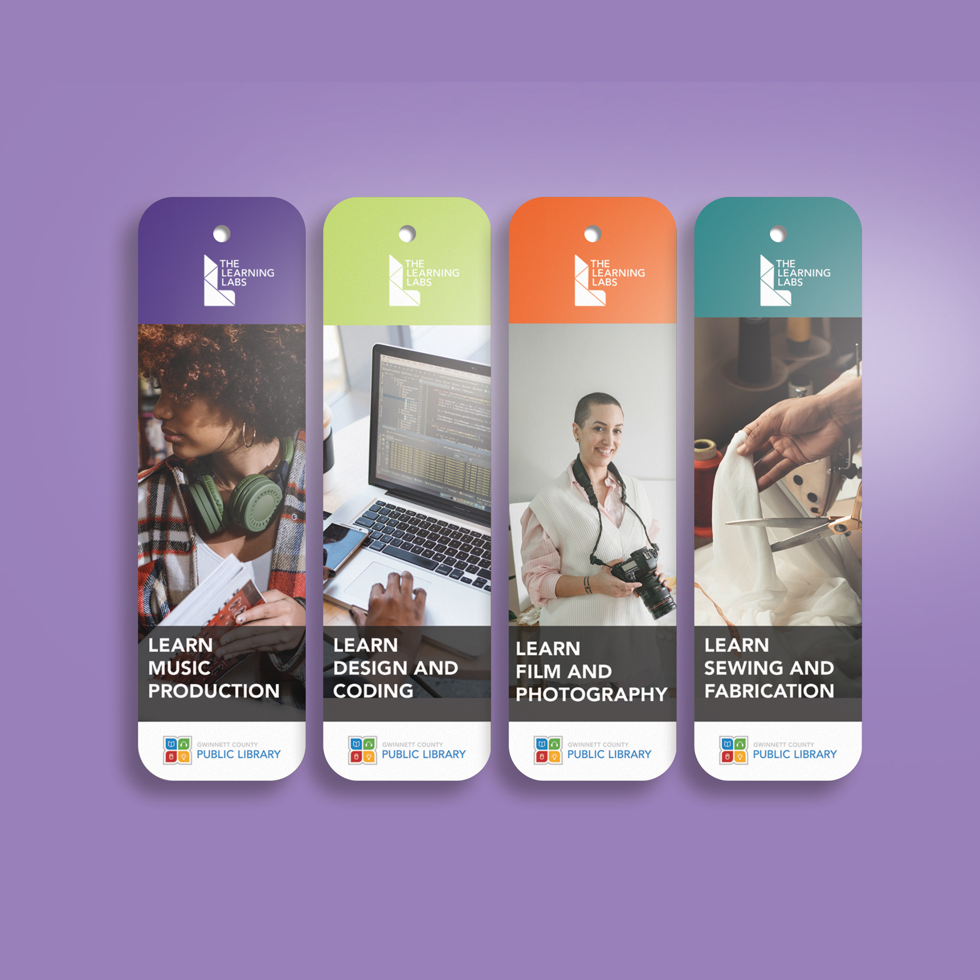
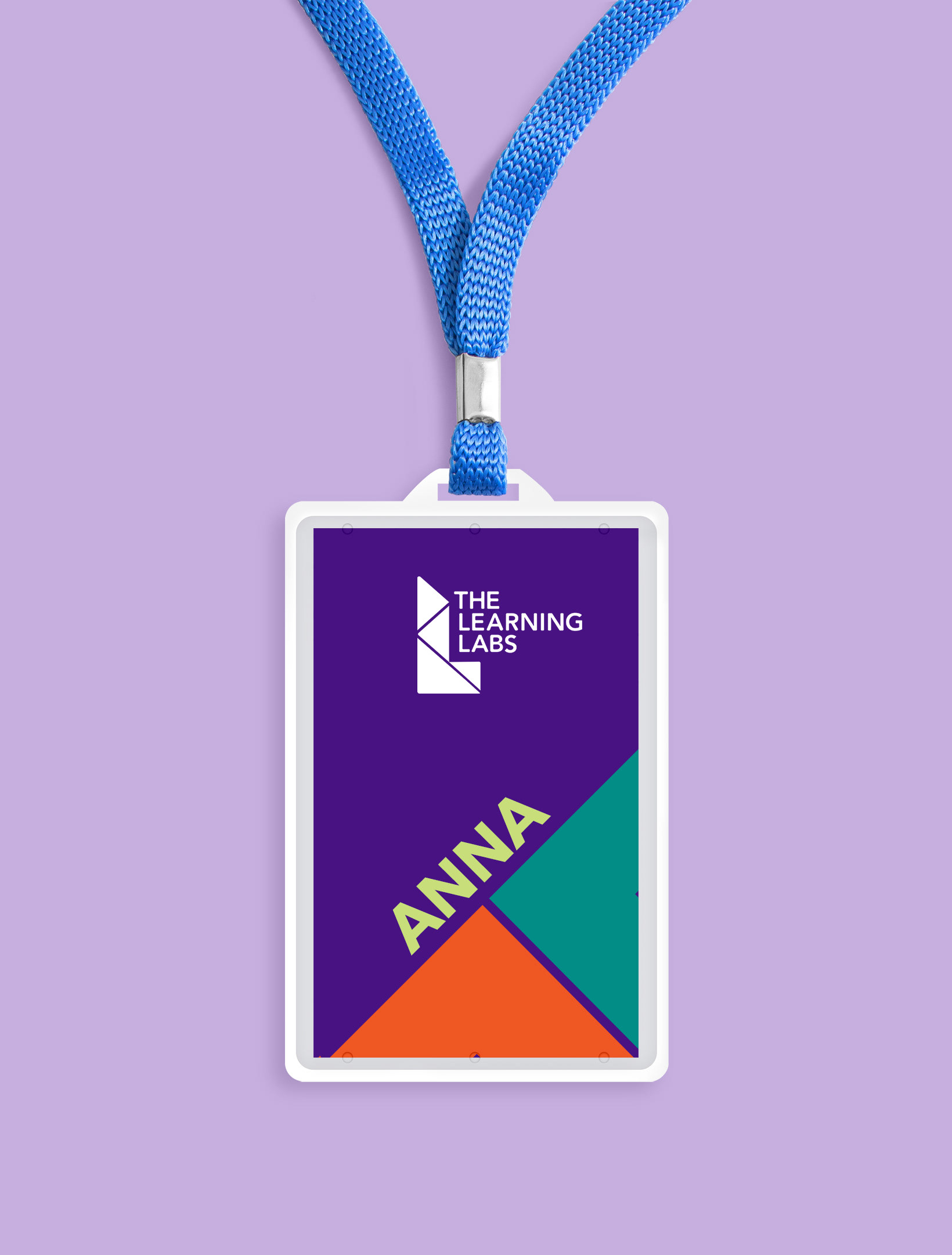
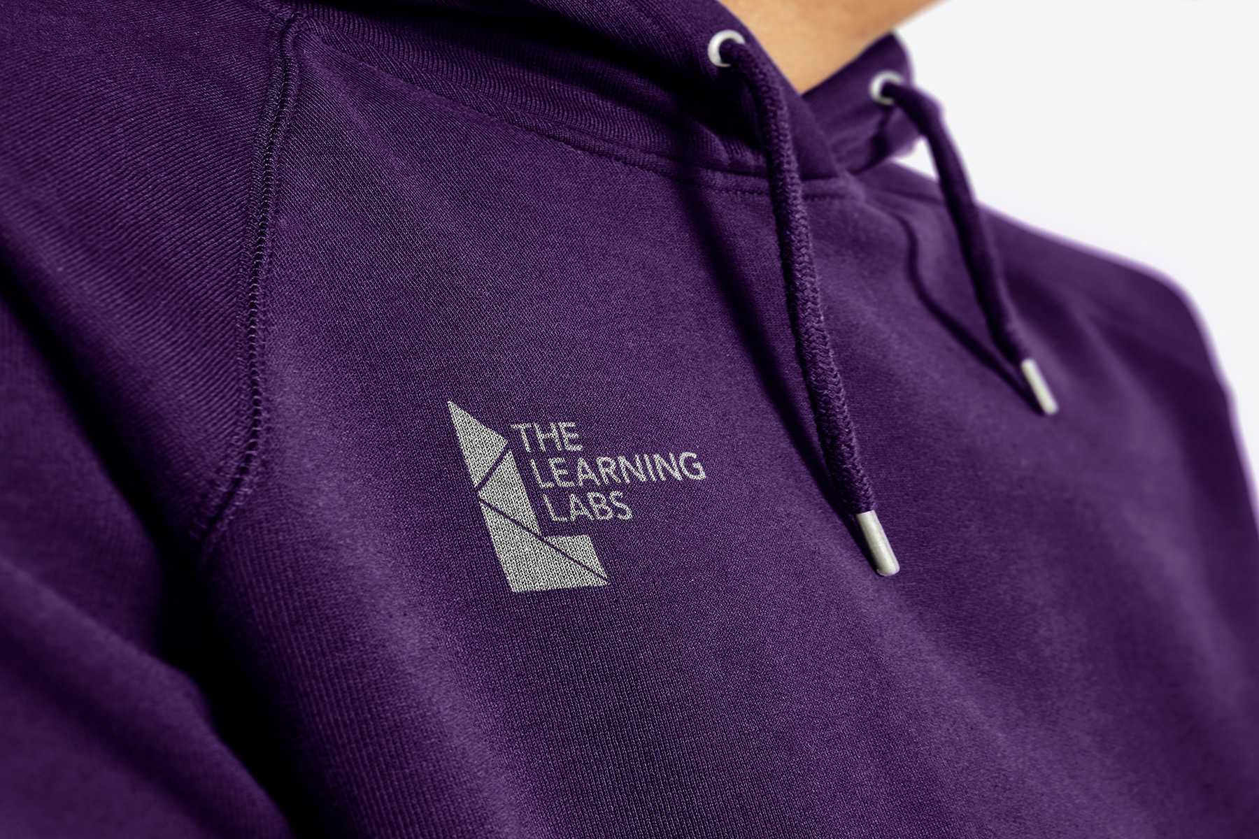
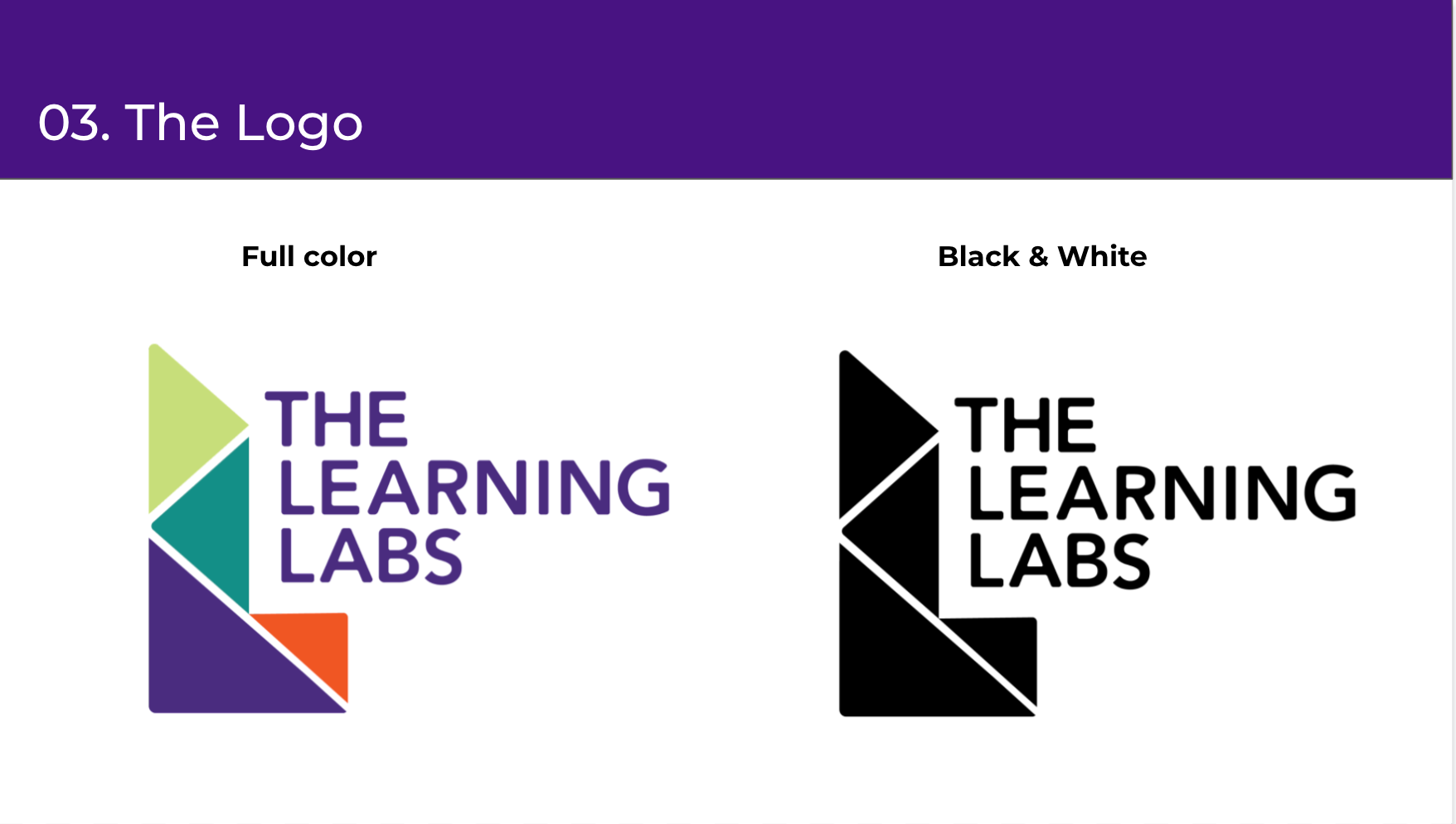
The Learning Labs wanted to create a logo more reflective of its position as a department within the public library that is targeted to an older demographic than elementary ages students. I created a complete identity with logo, colors and marketing that targeted the core patrons of students, tinkerers and content creators.
The Problem
The Learning Labs is a department inside of the Gwinnett Country Public Library (GCPL) which has its own logo and branding. Creating something unique and different, while necessary, might dilute the GCPL brand.
Insight
The Learning Labs, unlike other parts of the library, is age-restricted. The elementary colors of the main logo don't do much to describe what the Labs do, or give the aesthetic of being more than tutoring or reading to children.
Design Intent
The intention behind the brand is simple:
⤷ Separate the Labs from the larger branding of GCPL.
⤷ Make the labs feel more mature while still being fun and creative.
⤷ Create a brand strong enough to live on its own that doesn't overpower the library as a whole.
Outcome
A fully realized brand from concept to creation. While the brand was not accepted by GCPL for greater brand purposes, the colors - which are modifications of their current colors - still are used in the Labs.